Quality Requirements and Standards
Quality of HbA1c in 2014, Part Two
The second installment discussing the quality of HbA1c devices in 2014, based on the new study by Lenters-Westra and Slingerland in Clinical Chemistry. The good news: now 4 out of 7 methods meet the minimum analytical performance. The bad news: that's still 3 of 7 that don't. There's still a lot of room for improvement.
Another Teaching Moment: 2014 POC HbA1c Performance
Part Two. Using the Method Decision Chart
James O. Westgard, phd
juLY 2014
In part 1, we referenced a new report on the performance of POC HbA1c instruments that has been published online by the Clinical Chemistry journal [1]. Authored by Lenters-Westra and Slingerland, this report extends their earlier work on evaluation of performance of HbA1c devices [2] and again points out that some POC instruments do not satisfy current performance criteria.
Finding the critical performance results
The results of replication experiments can be found in Table 1 and comparison of methods experiments in Table 2 (presented in units of %Hb) as well as Figures 1 and 2 (presented in SI units). Sorting out the statistics is the first part of making sense of the results.
Table 1 [1] provides the CV’s for 2 levels of controls (based on CLSI EP5 protocol) and also for patient duplicate analyses (based on EP9 protocol). In principle, the results from EP5 should better reflect the expected performance because they include both within and between run variation, whereas the results on patient duplicates reflect only within run variation. However, for unit use devices, it is possible that the major source of variation is the unit device itself, in which case the results should be very similar. For assessment of performance in this discussion, the results from the control material close to the important diagnostic concentration of 6.5 %Hb have been selected, as shown in column 2 in Figure 2-1.
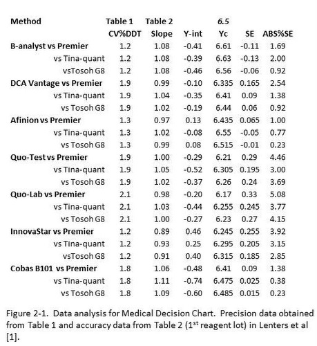
Table 2 [1] provides both regression statistics (y=slope*x + y-intercept) for comparison of each test method with 3 different reference methods, plus provides this information for 2 different reagent lots. For assessment of performance here, column 1 in Figure 2-1 identifies the test method and the 3 reference methods, column 3 provides the slope, and column 4 the y-intercept for the 1st reagent lot that was studied. Note that Deming regression has been used so that we don’t need to be concerned with the range of results that are included in the comparison study.
The remaining columns in Figure 2-1 represent the calculation of the Test System concentration corresponding to the diagnostic concentration of 6.5 %Hb (column 5), the Systematic Error (SE) or bias between the test and comparison methods (column 6), and finally the expression of that difference as an absolute %SE or %Bias (column 7). Thus, the important information about precision is presented in column 2 and bias in column 7, both present in terms of percent.
Making sense of the statistics
To evaluate performance relative to the current quality requirement, which is a TEa of 6.0% as defined by both CAP and NGSP, a Method Decision Chart can be prepared to relate the accuracy and precision observed for a method to the quality required for the test. Here are the steps for preparing that chart:
1. With a sheet of graph paper, scale the y-axis from 0.0 to TEa (6.0%) and scale the x-axis from 0.0 to TEa/2 (6.0%/2, or 3%). Label the top of the graph “Method Decision Chart TEa=6.0%”, the y-axis “Accuracy - Observed %Bias” and the x-axis “Precision – Observed %CV”.
2. Draw lines that represent sigma quality, as follows:
a. 2-sigma, Y-intercept=6.0%, X-intercept=6.0%/2 or 3.0%;
b. 3-sigma, Y-intercept=6.0%, X-intercept=6.0%/3 or 2.0%;
c. 4-sigma, Y-intercept=6.0%, X-intercept=6.0%/4 or 1.5%;
d. 5-sigma, Y-intercept=6.0%, X-intercept=6.0%/5 or 1.2%;
e. 6-sigma, Y-intercept=6.0%, X-intercept=6.0%/6 or 1.0%.
Figure 2-2 illustrates the preparation of the Method Decision Chart and shows what your chart should look like.
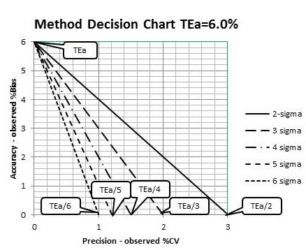
Figure 2-2 Preparation of a Medical Decision Chart for HbA1c where TEa = 6.0%
Judging acceptability of performance
What remains is to plot the “operating points” of the methods. The x-coordinate is the observed %CV found in column 2, Figure 2-1, and the y-coordinate is the observed ABS%SE or %Bias found in column 7. Given that 3 different reference methods were used in the comparison study, there are 3 points per method, but all have the same %CV. In a sense, there is an interval that describes quality on the sigma-scale to account for the 3 reference methods.
Figure 2-3 provides a graphical summary of all of these results – 7 test methods, each compared to 3 reference methods.
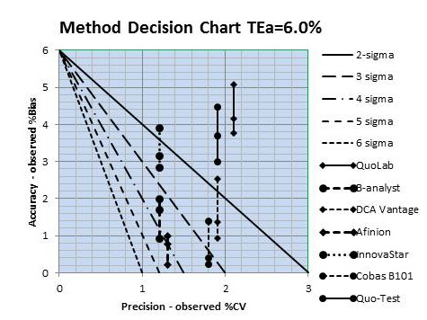
Figure 2-3. HbA1c sigma quality for 7 test systems, each compared with 3 reference methods. Precision taken from Table 2-1, column 2, and accuracy from column 7
Two methods are clearly less than 2-sigma quality, i.e., all 3 points are above the 2-sigma line, which means they do not provide acceptable performance. Two other methods show performance less than 3-sigma, i.e., all 3 points/method are above the 3-sigma line. One method overlaps the 3 sigma line and 2 others overlap the 4 sigma line. Those last 2 methods would be the best choices for application in your laboratory based on these results.
Relating Sigma quality to SQC
To demonstrate the importance of achieving 4-sigma performance, Figure 2-4 shows the relationship between sigma-quality (x-axis, top scale) and the probability (y-axis) for detecting medically important systematic errors (x-axis, bottom scale). Sigma can be directly related to the size of the systematic error that needs to be detected, i.e., the medically important SE is equal to sigma minus 1.65. The capability of difference SQC procedures to detect systematic errors is shown by the different “power curves,” which are identified – top to bottom- in the key at the right side of the graph.
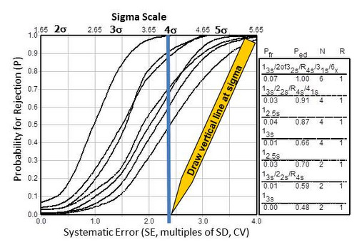
Figure 2-4. Rationale for goals of 4-sigma quality or higher in order that SQC procedures provide a probability of 0.90, or 90% chance, of detecting medically important systematic errors.
For example, a 4-sigma quality test is represented by the vertical line that has been drawn on the graph. The probability for error detection can be read from the y-axis for the points of intersection with the power curves. To achieve at least a probability of 0.90, or 90% chance of detecting medically important systematic errors, it will be necessary to employ one of SQC procedures corresponding to the top 3 power curves. The highest curve represents a multirule procedure with 6 control measurements per run. The next two curves represent either a multirule procedure or a single rule using 2.5s limits, both required 4 control measurements per run. Therein lies the reason for aiming for at least 4 sigma quality in order to achieve 90% detection of medically important errors – selecting a method that can be adequately controlled in your laboratory. The advantage of achieving 5 sigma quality would be the capability of controlling a method with only 2 control measurements per run.
Given the sigma quality of these methods and given that these test systems are intended for use in doctors’ offices and Point-of-Care applications where knowledge and skill with SQC may be limited, it will be difficult to assure that the quality achieved in routine applications will satisfy the demanding requirements for diagnosis and monitoring of diabetic patients. Several of these methods achieve better performance than those studied in the earlier paper [2], but the demands for quality have also changed (TEa now 6.0%, vs 10% earlier). Even greater improvements in performance are needed to meet the currently demanding quality requirement.
A Teaching Moment – 2014
You can repeat this assessment of quality on the sigma-scale for the 2nd reagent lot in Table 2. This would be good practice to improve your data analysis skills. Here are some suggestions for doing this.
- Set up an electronic spreadsheet such as MicroSoft Excel to perform the calculations illustrate in Table 2-1 in this lesson.
- Use the same CVs as shown in Table 2-1;
- Enter the slopes and intercepts obtained in the comparison for the 2nd reagent lot.
- Calculate the critical Y value that corresponds to an Xc decision concentration of 6.5 %Hb.
- Subtract the calculated Yc from Xc to determine the Systematic Error (SE) which is the bias expected at 6.5 %Hb.
- Express that bias in % by dividing by Xc, then multiplying by 100.
- Use the ABS function to express %SE as an absolute value.
- If you want a real challenge, set up the Method Decision Chart using the graphical capabilities of Excel. Otherwise, prepare the chart manually.
- Plot the “operating points” for each test device.
- Compare the sigma results for the 2nd reagent lot with those for the 1st reagent lot.
Again, you may want to review the previous series of lessons [3] to guide you through the method evaluation process. Note that you want to use the DCCT (Diabetes Control and Complications Trial) units of %Hb for the US marketplace. Data is SI units is also provided in Table 1 and Figure 1 (A, B, C, D) and Figure 2 (A, B, C), which will be of more interest in other parts of the world. In the next lesson, we’ll go through the calculations in SI units.
References
- 1. Lenters-Westra E, Slingerland RJ. Three of 7 hemoglobin A1c point-of-care instruments do not meet generally accepted analytical performance criteria. http://hwaint.clinchem.org/cgi/doi/10.1373/clinchem.2014.224311
- 2. Lenters-Westra E, Slingerland RJ. Six of eight hemoglobin A1c point-of-care instruments do not meet the general accepted analytical performance criteria. Clin Chem 2010;56:44-52.
- 3. See Part XI for links to these lessons. www.westgard.com/hba1c-methods-part11.htm