Basic Method Validation
The Data Analysis Tool Kit
James O. Westgard, Ph.D.
Are you less frightened of statistics when we talk about them as tools? How about talking about statistics without showing you any equations? Well, that's what this lesson by Dr. Westgard does. If you can think about method validation as a job that needs a set of tools, you're ready to read this article.
|
|
| Note: This lesson is drawn from the first edition of the Basic Method Validation book. This reference manual is now in its fourth edition. The updated version of this material is also available in an online training program |
MV - The Data Analysis Toolkit
- Tools, not equations!
- Recommended tools for data analysis
- Where to get the tools
- When to use each tool
- Example tools
- References
This lesson is actually about statistics, but I didn't dare put "statistics" in the title. Many people get uncomfortable at the mention of "statistics". Others become uncomfortable when they see the equations for the statistical calculations. By now - three sentences into this lesson - you may be wondering if you can just skip the lesson and avoid the topic. The answer is NO; you need statistics to make sense of the data collected in method validation experiments.
Tools, not equations!
To reduce the mental roadblocks in understanding statistics, there aren't any equations in this lesson. Instead, we're going to assume the calculations can be easily performed with the calculator and computer technology that's available today. Your main job will be to recognize what calculations are useful for different sets of data.
When I lecture on this topic, I begin by showing the class a bunch of tools, such as a hammer, wrench, saw, and screwdriver. Office tools (such as a stapler, scissors, paper, and pen) would provide just as good examples, but you're too comfortable with those tools. I want you to learn that you can use tools, even if you're not comfortable with them. So, let's consider the hammer, wrench, saw, and screwdriver.
- Which tool would be most useful for hanging a picture on the wall?
- Which tool would you use to tighten the bows on your sunglasses.
- Which tool do you want to take along at Christmas time when you go into the forest to get your tree?
- Which tool do you hope to have along if your car has a flat tire?
You don't have to be an engineer, mechanic, or carpenter to recognize which tool fits these jobs. Everyone makes use of these tools to do certain basic jobs. While there are more complicated applications that take more skill and knowledge - and sometimes more specialized tools, everyone is capable of making practical use of the common tools.
It can be the same with statistics!
Recommended tools for data analysis
Statistics are just tools for combining many experimental results and summarizing all the data in just a few numbers. Remember that the objective of each experiment is to estimate the amount of error from the data collected. The key with statistics is to know which ones will provide useful information about the errors of interest in the different experiments.
Before trying to estimate these errors, we need to define the usable analytical range (or reportable range) of the method so that the experiments can be properly planned and valid data can be collected. The reportable range is usually defined as the range where the analytical response of the method is linear with respect to the concentration of the analyte being measured.
Then we start with the error analysis. First, we want to know the imprecision or random error from the 20 or more data points collected in a replication experiment. Then we need to estimate the systematic error from the 40 or more data points collected in a comparison of methods experiment. Finally, we need to make a judgment on the performance of the method on the basis of the errors that have been obesrved. The statistics are used to make reliable estimates of the errors from the data that have been collected.
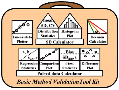 Here's a picture of the tool kit you need to analyze the data from basic method validation experiments. The tool kit includes several calculators and plotters:
- Linear data plotter to display the observed method response versus the relative or assigned concentrations for a series of solutions or specimens;
- SD calculator to determine distribution statistics (mean, SD, and CV) and to display a histogram of the distribution;
- Paired data calculator to determine regression statistics (slope or a, y-intercept or b, standard deviation about the regression line or sy/x, and correlation coefficient, r), display the data in a comparison plot (test method as y, comparison method as x), determine t-test statistics (bias, SDdiff, and t-value), and display data in a difference plot (y-x vs x);
- Decision calculator to judge performance,
Note also that these tools often include both calculations and graphical displays of the data. There is an association between certain calculator and graphs because they complement each other for describing and displaying a set of data. For example, distribution statistics are use together with a histogram plot to descibe and display data for imprecision or random error. For inaccuracy or systematic error, regression statistics are used along with a comparison plot, or t-test statistics are used together with a difference plot.
Note also that there s a natural order for using the tools, as suggested by their location in the tool kit. Those at the top are generally pulled out first, e.g. the linear-data plotter is used in the beginning to establish the reportable range of the method, after wich the SD calculator will be used to estimate the imprecision or random error, whose acceptability can be assessed using the decision calculator. After these steps, the paired-data calculator will be used to estimate the inaccuracy of the method and the decision calculator used again to assess the overall performance of the method.
Where to get the tools
These calculator tools may be obtained from hand held calculators (e.g., Texas Instruments), electronic spreadsheets (e.g., Excel, Lotus 123), common statistics packages (Minitab, SAS, SPSS), specialized method validation software written for laboratory applications, and also from interactive web-calculators on this website. Many of these sources will also provide appropriate graphical displays, or you can construct them manually using graph paper. The Method Decision Chart should be constructed manually using graph paper.
We will provide more detailed discussions of the statistical calculations in other lessons, as well as the fine points of what the statistics mean and how they should be interpreted. For now we're going to focus on the bigger picture - which tools are appropriate for the different method validation experiments.
When to use each tool
Given a set of experimental data, you need to recognize which tool is right for that job. Here are some general guidelines:
- Random error (RE) is almost always estimated by calculating a standard deviation. The experiment itself determines what factors contribute to the estimate, e.g., the replication experiment limits the RE to just the method being tested, whereas the comparison of methods experiment can provide an estimate of the RE between methods, which depends on the variation observed for both the test and comparison method.
- Systematic error (SE) is related in some way to the calculation of a mean or average. This may be the average difference between paired samples in a comparison of methods study, or the difference between the means between two methods, or a representation of the average relationship as given by the line of best fit through the method-comparison data.
- Remember that a decision on the acceptability of a method's performance is a judgment on whether the observed errors will affect the medical usefulness of the test. The statistics provide the best estimate of the size of the errors [1]. You have to make the judgment on whether those errors will affect the medical usefulness of the test [2]. You can do this by defining a quality requirement in the form of an allowable total error, TEa, such as defined by the CLIA proficiency testing criteria for acceptable performance. A simple graphical tool called the Method Decision Chart can be used to help you judge method performance [3].
Example tools for Educational use
Internet calculators for educational use are available. These web-tools should be useful for working with example data sets and problem sets. However, they are not intended to answer all your data analysis needs for method validation studies. It is also recommended that you acquire your own calculator tools, either a general statistics program, a specialized method validation program, or an electronic spreadsheet.
The linear-data plotter is used with the data collected in the linearity experiment, where the purpose is to assess the analytical range over which patient results may be reported. The response of the method is plotted on the y-axis versus the relative concentration or assigned values of the samples or specimens on the x-axis. The “reportable range” is generally estimated as the linear working range of the analytical method.
The SD calculator is used for the data collected in the replication experiment, where the objective is to estimate the random error or imprecision of the method on the basis of repeated measurements on the same sample material. The statistics that should be calculated are the mean, SD, and CV. Also be sure to record the number of measurements used in the calculations.
- The mean, or average of the group of results, describes the central location of the measurements.
- The SD describes the expected distribution of results, i.e., 66% are expected to be within plus/minus 1 SD of the mean, 95% within plus/minus 2 SD of the mean, and 99.7% within plus/minus 3 SD of the mean.
- The CV, or coefficient of variation, is equal to the SD divided by the mean, times 100 to express in percent.
- The histogram displays the distribution of results. Ideally, the distribution should appear gaussian, or “normal.”
The paired data calculator may be used with the pairs of results on each specimen analyzed by the test and comparison methods in the comparison of methods experiment. This is the most complicated part of the statistical analysis and requires the most care and attention. Linear regression statistics may be used along with a comparison plot, or t-test statistics may be used along with a difference plot.
The regression statistics that should be calculated are the slope (b) and y-intercept of the line (a), the standard deviation of the points about that line (sy/x), and the correlation coefficient (r, the Pearson product moment correlation coefficient). You may also see the slope designated as m, the y-intercept as b, and the standard deviation as sresiduals, respectively. The correlation coefficient is included to help you decide whether the linear regression statistics or the t-test statistics will provide the most reliable estimates of systematic error.
- The slope describes the angle of the line that provides the best fit to the test and comparison results. A perfect slope would be 1.00. Deviations from 1.00 are an indication of proportional systematic error [1].
- The y-intercept describes where the line of best fit intersects with the y-axis. Ideally, the y-intercept should be 0.0. Deviations from 0.0 are an indication of constant systematic error [1].
- The sy/x term describes the scatter of the data around the line of best fit. It provides an estimate of the random error between methods which includes both the imprecision of the test and comparison methods, as well as possible matrix effects that vary from one specimen to another. It will never be zero because both the test and comparison methods have some imprecision [1].
- The correlation coefficient describes how well the results between the two methods change together. An r of +1.00 indicates perfect correlation, i.e., all the points fall perfectly on a line that shows the test method values vs the comparison method values. Values less than 1.00 indicate there is scatter in the data about the line of best fit. The lower the r value, the more scatter in the data. The main use of r is to help you assess the reliability of the linear regression calculations – r should never be used as an indicator of method acceptability [1]. When r is 0.99 or greater, linear regression calculations will provide reliable estimates of errors. When r is less than 0.975, it is better to use the paired data calculations or an alternate (and more complicated) regression technique such as Deming’s regression [4,5].
- A comparison plot should be used to display the data from the comparison of methods experiment (plotting the comparison method value on the x-axis and the test method value on the y-axis). This plot is then used to visually inspect the data to identify possible outliers and to assess the range of linear agreement [1].
The t-test statistics of interest are the bias, SD of the differences, and lastly, something called a t-value which also requires knowledge of the number of paired sample measurements. Again, be sure to keep track of the number of measurements, which for the comparison of methods experiment is the number of patient specimens compared.
- The bias is the difference between the averages by the two methods, which is also the same as the average difference for all the specimens analyzed by the two methods. It provides an estimate of the systematic error or average difference that is expected between the methods – the smaller the bias, the smaller the systematic error, the better the agreement.
- The SD of the differences provides an estimate of the random error between the methods. It will never be zero because both the test and comparison methods have some imprecision.
- The t-value itself is an indicator of whether enough paired sample measurements have been collected to know whether the observed bias is real, or statistically significant. As a rule of thumb, in a method comparison experiment where the minimum of 40 patient specimens have been compared, if t is greater than 2.0, the data is sufficient to conclude that a bias exists. It’s important to note that it’s the size of the bias that’s important in judging the acceptability of the method, not the size of the t-value.
- A difference plot should be used to display the differences between paired results, plotting the difference between the test method minus comparison method values on the y-axis versus the comparison method result on the x-axis. Difference plots are being popularized today because of their simplicity [6], however, their use and interpretation are not so simple when you want to make a quantitative and objective decision about method performance [7].
The decision calculator is used to display the estimates of random and systematic errors and judge the performance of the method [3]. Therefore, this chart depends on the estimates of errors that are obtained from other statistical calculations. In brief, the chart is drawn on the basis of the quality requirement that is defined for the method and shows the allowable inaccuracy on the y-axis versus the allowable imprecision on the x-axis. The observed imprecision and inaccuracy of the method are then plotted to display the method’s “operating point” (y-coordinate is the estimate of inaccuracy or SE, x-coordinate is the estimate of imprecision or RE). The position of this operating point is interpreted relative to the lines that define areas of “poor,” “marginal,” “good,” and “excellent” performance. See the PDF files for details.
A note about our online tools
Our online calculators are set up for a fixed number of data points, e.g., 20 points for the SD calculator and 40 points for the Paired Difference, Linear Regression, and Correlation calculators. These calculator tools should be useful for example data sets and problem sets included with these instructional materials. However, they are not intended to answer all your data analysis needs for routine method evaluation studies. It is also recommended that you set up your own calculator tools using an electronic spreadsheet.
References:
- Westgard JO, Hunt MR. Use and interpretation of common statistical tests in method comparison studies. Clin Chem 1973;19:49-57.
- Westgard JO, Carey RN, Wold S. Criteria for judging precision and accuracy in method development and evaluation. Clin Chem 1974;20:825-33.
- Westgard JO. A method evaluation decision chart (MEDx Chart) for judging method performance. Clin Lab Science. 1995;8:277-83.
- Stockl D, Dewitte K, Thienpont M. Validity of linear regression in method comparison studies: limited by the statistical model or the quality of the analytical data? Clin Chem 1998;44:2340-6.
- Cornbleet PJ, Gochman N. Incorrect least-squares regression coefficients in method-comparison analysis. Clin Chem 1979;25:432-8.
- Bland JM, Altman DG. Statistical methods for assessing agreement beween two methods of clinical measurement. Lancet 1986;307-10.
- Hyltoft Petersen P, Stockl D, Blaabjerg O, Pedersen B, Birkemose E, Thienpont L, Flensted Lassen J, Kjeldsen J. Graphical interpretration of analytical data from comparison of a field method with a reference method by use of difference plots [opinion]. Clin Chem 1997;43:2039-46.