Quality Management
OPSpecs Charts
James O. Westgard, Ph.D.
What if there was a chart that allowed you to choose a rule that would guarantee you met the quality you specify, just by figuring out if a point is above or below a line? OPSpecs Charts allow you to choose the methods for your laboratory by simple visual inspection. If you know your bias, your CV, and the quality you need to acheive, you can pick the best control rule in less than a minute!
- What are OPSpecs?
- What is an OPSpecs chart?
- How do you read an OPSpecs chart?
- How do you use an OPSpecs chart?
- Where do you find OPSpecs charts?
- How is an OPSpecs chart prepared?
- Why does the OPSpecs chart work?
- QC planning applications using OPSpecs charts
- FAQ's about OPSpecs charts
- References
Introduction
Managing the quality of laboratory testing processes is a very complicated process. Just planning QC procedures requires several steps, beginning with defining the quality required, evaluating the imprecision and inaccuracy of the analytical method, determining what size errors need to be detected by QC, obtaining information about the performance characteristics of candidate QC procedures, assessing probabilities for error detection and false rejection, selecting control rules and a number of control measurements, adopting a total QC strategy, and periodically reassessing for changes in performance.
When getting started with QC planning, it often looks like the beginning of a long journey. I am reminded of the story where Hagar and Lucky Eddy are looking at a large map, seeking guidance on one of their many journeys. Hagar comments that it's a long way to where they're going. Lucky Eddy replies "Maybe we should have gotten a smaller map." For planning QC procedures, we do have smaller maps available now in the form of OPSpecs charts. These charts can greatly shorten the path to selecting appropriate control rules and numbers of control measurements. This lesson will show you how they work.
What are OPSpecs?
OPSpecs stands for operational process specifications, or simply operating specifications. They describe the imprecision and inaccuracy that are allowable for a method and the QC that is necessary to monitor the method's performance. The OPSpecs idea is based on Deming's concept of an operational definition, which is supposed to describe what needs to be done and how to know if it is done properly. For a laboratory test where a desired level of quality is to be achieved, we need to know the imprecision and inaccuracy allowable for a method and the QC needed to detect medically important errors. Management must implement a method with the proper performance and provide analysts with a QC procedure that can assess whether the method is working properly.
What is an OPSpecs chart?
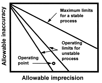 The OPSpecs chart is a relatively new QC planning tool that was introduced in the clinical laboratory literature in 1992 [1,2]. An OPSpecs chart shows the relationship between the quality required for a test and the imprecision, inaccuracy, and QC that are necessary to assure that quality is achieved in routine operation. The chart displays the allowable inaccuracy on the y- axis versus the allowable imprecision on the x-axis. It shows one or more lines, or operating limits, that correspond to different QC procedures, or different control rules and different numbers of control measurements (N). It may also show a line for the maximum limits of a stable process or a total error criterion used for judging acceptability in method evaluation studies. The imprecision and inaccuracy of an individual method is shown by an operating point.
Initially, an OPSpecs chart appears complex and difficult to understand because it contains information about the quality requirement for the test, the specified probability of error detection (Ped) or analytical quality assurance, the expected probability for false rejection of the QC procedure, and the imprecision and inaccuracy that are allowable for different control rules and different numbers of control measurements. That's a lot of information, all of which is important in managing the analytical quality of a laboratory test.
How do you read an OPSpecs chart?
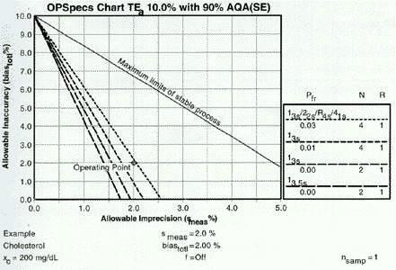 Start with the heading at the top of the chart. This example has been prepared for an analytical quality requirement (TEa) of 10% and for a specified level of error detection 90% AQA(SE), or analytical quality assurance for systematic error. The %AQA describes the chance of detecting medically important systematic errors and is equivalent to Ped expressed as a percent. OPSpecs charts can also be prepared for 50% and 25%AQA (SE), and for 80%, 50%, and 25% AQA(RE) for detection of increases in random error. OPSpecs charts can also be prepared for clinical quality requirements that are stated in the format of medically important changes or clinical decision intervals (Dint).
The y-axis shows the allowable inaccuracy and is scaled from 0 to TEa. The x-axis shows the allowable imprecision and is scaled from 0 to 0.5 TEa. The top line, labelled Maximum limits for stable process, describes the limits of inaccuracy and imprecision for a method that is perfectly stable and needs no safety margin, i.e., no quality control. The other lines describe the operating limits (allowable limits of imprecision and inaccuracy) for different QC procedures that would provide at least 90% detection of medically important systematic errors.
The key on the right side of the chart matchs the dots and dashes of the different lines to the particular control rules and numbers of control measurements (N) being considered. In general, the order of the QC procedures top to bottom will match the order of the lines on the chart. The key also describes the probablity for false rejection (Pfr) and indicates the number of runs (R) over which the control rules are applied. An R of 1 means the rules are applied to the control data in a single run; an R of 2 means the rules are applied over two consecutive runs, etc.
How do you use an OPSpecs chart?
Fortunately, an OPSpecs chart is very easy to use once you recognize it's just a map. You only need to identify your location on the map to know where you're at and to get some guidance on what to do. Your location (or operating point) is given by the coordinates of the imprecision and inaccuracy observed for the test method in your laboratory. Once you know where you're at on the OPSpecs chart, you can very quickly and easily do the following:
- identify appropriate QC procedures by the lines above the operating point;
- assess how improvements in the precision and accuracy would change the operating point of your method and lead to simpler and less costly QC procedures;
- estimate the maximum allowable imprecision for a test from the x-intercepts of the operating lines for QC procedures you want to implement.
Where do you find OPSpecs charts?
To get started using OPSpecs charts, you have to get the maps. You can use a collection of maps available in an atlas called the OPSpecs Manual [3]. The OPSpecs charts cover the full range of analytical quality requirements defined by CLIA proficiency testing criteria and consider most of the commonly used control rules with Ns of 2 and 4 and 3 and 6. You can prepare individual charts using specialized software such as the QC Validator program [4], or possibly using an electronic spreadsheet if you have the time and skill.
How is an OPSpecs chart prepared?
To prepare an OPSpecs chart, a power function graph must be available to estimate the size of errors that will be included in the quality-planning model. Using a power function graph, the desired probability of rejection is located on the y-axis and a horizontal line is drawn to intersect the power curves for the QC procedures of interest. Vertical lines are then dropped to the x-axis to determine what size errors could be detected with the specified probability, as shown in this figure, where the desired error detection has been specified as 0.90 (or 90% AQA).
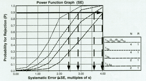 For the QC procedures shown - 13s/22s/R4s/41s with N=4, 13s with Ns of 4 and 2, and 13.5s with N=2, all with R=1 - the systematic errors that can be detected with a 90% chance in the first run would be approximately 2.4s, 2.8s, 3.6s, and 4.0s. Note that if OPSpecs charts were to be prepared for other levels of error detection, such as 50% and 25% AQA, the horizontal lines would be drawn at 50% and 25%, resp., then the intersections with the power curves again read off the x-axis.
Given this information, the allowable limits of imprecision and inaccuracy can be calculated from an error budget or quality-planning model. For example, the analytical model is given by the following equation:
TEa = biasmatx + biasmeas + ![]() SEcontsmeas + zsmeas
SEcontsmeas + zsmeas
To simplify, let's combine biasmatx and biasmeas and represent as biastotl:
TEa = biastotl + ![]() SEcontsmeas + zsmeas
SEcontsmeas + zsmeas
Solving for biastotl gives the following equation:
biastotl = TEa - ![]() SEcontsmeas + zsmeas
SEcontsmeas + zsmeas
Combining terms gives:
biastotl = TEa - (![]() SEcont + z)smeas
SEcont + z)smeas
To prepare an OPSpecs chart using an electronic spreadsheet, you can calculate biastotl for a series of values of smeas. For example, if TEa is 10%, ![]() SEcont is 2.4s for the multirule control procedure with N=4, and z is set as 1.65 for a maximum defect rate of 5%, then biastotl can be calculated for different smeas values as follows:
SEcont is 2.4s for the multirule control procedure with N=4, and z is set as 1.65 for a maximum defect rate of 5%, then biastotl can be calculated for different smeas values as follows:
10.0% for smeas of 0.0% [10 - (2.4+1.65)0.0]
7.98% for smeas of 0.5% [10 - (2.4+1.65)0.5]
5.95% for smeas of 1.0% [10 - (2.4+1.65)1.0]
3.92% for smeas of 1.5% [10 - (2.4+1.65)1.5]
1.90% for smeas of 2.0% [10 - (2.4+1.65)2.0],
and 0.0% for smeas of 2.5% [10 - (2.4+1.65)2.5].
These biastotl values can then be plotted on the y-axis versus smeas on the x-axis to describe the operating limits for imprecision and inaccuracy for this QC procedure. Similar calculations could be performed for different QC procedures to provide a simultaneous display of the operating limits for all the candidate QC procedures of interest to you. [See references 5 and 6 for example spreadsheet calculations.]
Why does the OPSpecs chart work?
For those QC procedures whose power curves were shown above, the folowing figure shows the chart of operating specifications (OPSpecs chart) when biastotl is plotted vs smeas for different QC procedures. In displaying these operating limits in this graphical form, note that a straight line is expected. The equation for calculating biastotl is of the form y = a + bx, where the y-variable is biastotl, the x-variable is smeas, a is the y-intercept which is equal to the analytical quality requirement for proficiency testing (TEa=TEPT), and b is the slope (![]() SEcont + z) which depends on the error detection capability of the QC procedure (
SEcont + z) which depends on the error detection capability of the QC procedure (![]() SEcont) and the maximum allowable defect rate (z).
SEcont) and the maximum allowable defect rate (z).
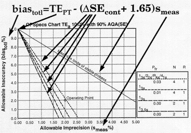 The top line in this graph corresponds to the case where
 ![]() SEcont is 0.0, i.e., there is no consideration or allowance for the performance of a QC procedure. This line is labeled maximum limits for a stable process to indicate that these maximum values for imprecision and inaccuracy assume a stable process that has no problems that need to be detected by QC. The lower lines show the operating limits when different QC procedures are used to guarantee or assure the desired quality will be achieved. For this example, an appropriate QC procedure would be the multirule procedure with N=4 because the operating point is below the operating limits of that QC procedure. The other single rule procedures would not provide appropriate error detection as shown by being below the method's operating point. For more detailed illustrations of the use of OPSpecs charts, see our many QC Design applications.
SEcont is 0.0, i.e., there is no consideration or allowance for the performance of a QC procedure. This line is labeled maximum limits for a stable process to indicate that these maximum values for imprecision and inaccuracy assume a stable process that has no problems that need to be detected by QC. The lower lines show the operating limits when different QC procedures are used to guarantee or assure the desired quality will be achieved. For this example, an appropriate QC procedure would be the multirule procedure with N=4 because the operating point is below the operating limits of that QC procedure. The other single rule procedures would not provide appropriate error detection as shown by being below the method's operating point. For more detailed illustrations of the use of OPSpecs charts, see our many QC Design applications.
References
- Westgard JO. Charts of operational process specifications ("OPSpecs charts") for assessing the precision, accuracy, and quality control needed to satisfy proficiency testing criteria. Clin Chem 1992;38:1226-33.
- Westgard JO. Analytical quality assurance through process planning and quality control. Arch Pathol Lab Med 1992;116:765-769.
- Westgard JO. OPSpecs Manual - Expanded Edition. Ogunquit, ME, Westgard QC, 1996.
- Westgard JO, Stein B. An automatic process for selecting statistical QC procedures to assure clinical or analytical quality requirements. Clin Chem 1997;43:400-403.
- Westgard JO, Wiebe DA. Cholesterol operational process specifications for assuring the quality required by CLIA proficiency testing. Clin Chem 1991;37:1938-44.
- Westgard JO, Wiebe DA. Cholesterol operational process specifications for assuring the quality required by CLIA proficiency testing. Clin Chem 1991;37:1938-44.