Quality Management
Area Under a Table
James O. Westgard, Ph.D.
This is a lesson on how to determine the performance of a QC procedure using a table of areas under a normal curve. At the intersection QC Design, Six Sigma, statistics, and QC - you can establish your capability to detect an important medical error
Assessing probabilities of rejection for QC procedures- First a story
- Areas and distributions
- Tables of Areas
- Assessing the probability of false rejection (Pfr)
- Assessing the probability of error detection (Ped)
- Application to iQM technology
- An important conclusion about method performance and QC
- View this essay with an online calculator
This is a lesson on how to determine the performance of a QC procedure using a table of areas under a normal curve. The title comes from a discussion where several people were talking/questioning/commenting on how to do this. It's a mouthful to keep saying "Table of area under a normal curve." As the discussion went on, it somehow got shortened to "area under a table." When reflecting on this later, I thought the idea of the "area under a table" would be a useful instructional tool to help people overcome their "fear of statistics."
Here's how!
First a story
You are visiting Hong Kong and come upon a wonderful antique table. It turns out that the cost of shipping it home depends not on weight, but on volume. In fact, you can ship anything that fits under the table for free and you find a bunch of antique boxes and baskets that each take up about 1 square foot of space each (and the handles all fit under the height of the table).
How many boxes and baskets can you ship free if the table is 4 feet wide by 2 feet deep? Assuming that the legs don't take up any space, it's a simple calculation of the area of a rectangle - 4 times 2 or 8 square feet means 8 boxes and baskets. If the table had drawers on one side that were 1 foot wide, then the area on that side - 1 times 2 or 2 square feet - would have to be deducted, meaning you could only ship 6 baskets and boxes for free.
And you think I'm making this up!
 Areas and distributions
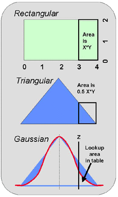
For a rectangular distribution, the calculations are simple, as discussed above and illustrated in the top part of this figure. You calculate the area in the whole distribution simply by multiplying length by width. You can calculate the area in a part or "tail" of the distribution in the same manner.
If the distribution were triangular, as shown in the middle part of this figure, the calculations are still easy - the area is one-half of the area of the rectangle whose height represents the part of the triangle of interest. Remember your high school geometry that's being taught in grade school today!
When the distribution is "normal" or "gaussian", as shown at the bottom of this figure, the calculation is more complicated. The simplest solution is to utilize a table of areas under a normal or gaussian curve.
 Tables of areas
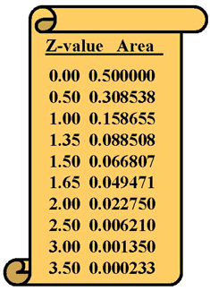
Tables of areas can be presented in two different ways. One common form gives the "area in the tail" of the distribution, as shown here. Another common form gives the "area in the center" or "area above the tail" of the distribution. The numbers, of course, are related. The area in the center is 0.5000 minus area in the tail. Be sure you know which format is being used when you make use of a table of areas.
Both types of tables are accessed using a "z-value" that represents the number of standard deviations from the mean. The number next to the z-value represents the area in half of the distribution, therefore the maximum value for an area in the table is 0.5000. The area in the other half of the distribution can be added to give the total area in the whole distribution, which is a maximum of 1.000.
The area values represent the probabilities of observing a measurement in that part of the distribution. For example, there's a probability of 0.500, or a 50% chance, that a measurement on a control material will be above it's mean. Of course, there's also a 50% chance that it will be below the mean.
Assessing the probability of false rejection (Pfr)
One useful application is to assess the probability for false rejections when using different control limits. For example, it is common knowledge that 1 out of 20 control measurements is expected to be outside 2 SD control limits. What's the source of that knowledge? It's the table of areas under a normal curve. Click here to read this article with a calculator that has the table embedded in it. (You will need Netscape Navigator version 4.7 or higher, or Internet Explorer version 6.0 or higher)
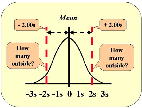 This figure shows the normal distribution along with the lines that represent 2 SD control limits. Use the table of areas above and look up the area that corresponds to a z-value of 2. The area 0.022750 represents one tail, therefore the area in both tails will be 2*0.022750 or 0.04550. Move the decimal place two to the right and you have the figure in percent, i.e., 4.55%. We commonly approximate that figure as 5% and describe this as "1 out of 20."
It's important to note that this 5% figure (or 1 out of 20) applies when there is 1 control measurement in an analytical run. If there are 2 control measurements, then this figure approximately doubles to 9%; with N=3, it's about 14%, and with N=4, about 18%. The high false rejection rate is the reason why the use of 2 SD control limits should be discouraged - false rejections waste time and effort in the laboratory. The use of 3 SD control limits would keep the false rejections at 1% or less for the range of N's up to 4; use of 2.5 SD control limits will keep the false rejections at 2% to 5% for Ns from 2 to 4.
Assessing the probability of error detection (Ped)
Generally we are interested in detecting systematic changes that cause the original error distribution to shift. As shown in this figure, the curve shown by the dashed line represents the original distribution and that by the solid line is the shifted distribution, or the medically important systematic error that needs to be detected by the QC procedure. This example is for a process having 6 sigma performance, as indicated by the solid red lines at the 6s positions on the x-scale (tolerance limits or quality requirements). Control limits are being set at 3 SD, as indicated by the dashed red lines at the 3s positions on the x-scale.
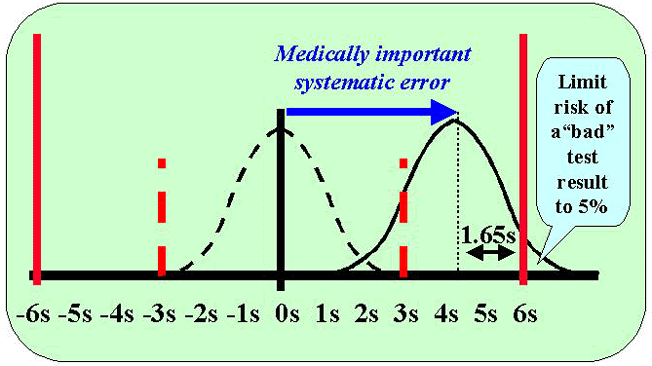
The medically important systematic error is defined as the shift that causes a 5% risk of a bad test result. This means that the tolerance limit or quality requirement cuts the error distribution at 1.65s to the right of the mean in order to limit the area in the tail to 0.05 or 5%. Here's where you use the table of areas in the opposite direction, i.e., you find the area of 0.05 and lookup the z-value, which is 1.65.
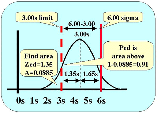 The next figure shows the calculations for assessing the probability of detecting this systematic error. Error detection depends on the area of the distribution above the 3.0s control limit (dashed red line). Here's how to figure it out.
- We know that the mean of the error distribution is 1.65s below the quality requirement (solid red line).
- We know there is a difference of 3.0s between the quality requirement of 6.0s and the control limit of 3.0s (6.0s - 3.0s).
- That means that the control limit cuts the tail of the error distribution at 3.0s minus 1.65s, or 1.35s to the left of the mean (3.00s-1.65s).
- Lookup the area in the tail for a z-value of 1.35. That value of 0.088508 gives the area in the tail to the left of the control limit. The area above the tail is 1.0000 minus the area in the tail, or 0.911492. We can round this to 0.91, which corresponds to a 91% chance of detecting the medically important systematic error.
Application to iQM technology
This methodology applies to QC procedures where control measurements are made and interpreted individually. For simultaneous interpretation of multiple controls with multiple rules, it gets more complicated and there is a need for computer tools, such as Westgard QC's Validator 2.0 and EZ RULES programs.
A good example where this "area and table" methodology is useful is Instrumentation Laboratory's new iQM technology for the GEM analyzer. Individual measurements on Process Control Solutions (PCS) are analyzed and interpreted on an on-going basis. Statistical control limits are defined by the manufacturer's specifications for "drift limits." Instrument precision performance is available from extensive field data. Quality requirements can be defined via the CLIA criteria for acceptable performance in proficiency testing.
Here's the step-by-step procedure for applying this methodology:
(1) Define the quality requirement (TEa)
(2) Determine method imprecision (SD)
(3) Calculate the sigma metric for method performance (s=TEa/SD)
(4) Determine the statistical control limit (CL) from the manufacturer's drift limit (DL) specification (CL=DL/SD)
(5) Lookup area for Zfr= CL and calculate Pfr=2*area
(6) Lookup area for Zed = s - CL - 1.65 and calculate Ped=1-area
These probabilities can then be converted to practical measures in terms of the time it takes to get a rejection signal. That's another lesson - coming soon!
An important conclusion about method performance and QC
From the example discussed above, it is clear that a process having 6 sigma performance needs very little QC, i.e., it can be controlled with a 13s rule and N=1, which will provide a probability of error detection of 0.91 (or a 91% chance of detecting a medically important systematic error) and a probability of false rejection of 2*0.00135 (or only a 0.2% chance of a false alarm). A major benefit of achieving 6 sigma performance is the ease of doing QC and the capability to assure - or guarantee - the quality of test results.