Quality Management
Normalized OPSpecs Charts
Are there normal and abnormal OPSpecs charts? No. A "normalized" chart is specially created so that you can use it for all methods, regardless of their quality requirements. It's one-stop shopping for OPSpecs charts - making it even easier to choose control rules for your laboratory methods. Read this lesson and then use the online calculator to see how it works - quickly, easily, and hassle-free.
- Concept of a normalized OPSpecs chart
- Review of the OPSpecs equation
- Example normalized OPSpecs chart
- Example calculation of a normalized operating point
- Example cholesterol QC selection from normalized OPSpecs charts
- Example glucose QC selection from normalized OPSpecs charts
- For your own applications
- Directions for using normalized OPSpecs charts
- Normalized OPSpecs chart for N=2 and 90% AQA
- Normalized OPSpecs chart for N=4 and 90% AQA
- Normalized OPSpecs chart for N=2 and 50% AQA
- Normalized OPSpecs chart for N=4 and 50% AQA
- Calculator for normalized operating point
- References
In an earlier lesson on Starting a QC Planning Process, I identified four possible approaches. The first two made use of the OPSpecs Manual and the QC Validator computer program to support the planning process. Lessons have been provided on Quality Planning Models and OPSpecs Charts and example applications have been presented to illustrate the use of the OPSpecs Manual and the QC Validator Program, thus these first two approaches are now well-documented on this website.
This lesson introduces a normalized OPSpecs chart that can be used with any analytical quality requirement that is presented in the form of an allowable total error. We described normalized OPSpecs charts in the original OPSpecs paper [1] and now provide those same charts on this website, as well as a web calculator to assist you in your applications.
Concept of a normalized OPSpecs chart
If you look at a collection of OPSpecs charts for different quality requirements, you will notice that the charts look pretty much the same for a given set of rules, N, and %AQA. However, the scales of the x and y axes are different and depend on the value of TEa. The idea for a normalized chart is to express the values on the x and y axes as a percentage of TEa so that one chart can be used for any quality requirement. The advantage is that you only need a few normalized charts to deal with a wide range of quality requirements. The disadvantage is that normalized OPSpecs charts require some additional calculations of the observed imprecision and inaccuracy to obtain a normalized operating point, thus the planning procedure is a little more complicated. Clinical quality requirements still can't be handled because the preanalytical factors are not consistent from test to test, thus they can't be standardized or normalized.
Review of the OPSpecs equation
Bear with me for a short time to review the analytical quality planning model and its relationship to the OPSpecs chart [2]. As shown in earlier lessons on quality planning models and OPSpecs charts, the equation that determines a line on the OPSpecs chart is as follows:
biasmeas = TEa - (![]() SE + 1.65)smeas
SE + 1.65)smeas
where biasmeas is the observed inaccuracy of the method, smeas is the observed imprecision of the method, TEa is the allowable total error and the y-intercept, and the slope is dependent on ![]() SE, which is the size of the systematic error that can be detected by a QC procedure with a specified probability, such as 0.90 (90% Analytical Quality Assurrance) or 0.50 (50% AQA).
SE, which is the size of the systematic error that can be detected by a QC procedure with a specified probability, such as 0.90 (90% Analytical Quality Assurrance) or 0.50 (50% AQA).
Let's divide both sides of this equation by TEa and multiply both sides by 100 to present biasmeas and smeas as a percentage of TEa:
(biasmeas/TEa)100 = {[TEa - (![]() SE + 1.65)smeas]/TEa}100, or
SE + 1.65)smeas]/TEa}100, or
biasmeas%TEa = 100 - (![]() SE + 1.65)smeas%TEa
SE + 1.65)smeas%TEa
where biasmeas%TEa = biasmeas(100)/TEa and smeas%TEa = smeas(100)/TEa, i.e., these terms for inaccuracy and imprecision are now presented as a percentage of the allowable total error.
Example normalized OPSpecs chart
The figure below shows that the y-axis is now scaled from 0 to 100% and the x-axis is scaled from 0 to 50%. Such an OPSpecs chart can be prepared by the QC Validator program by entering an analytical quality requirement of 100%, selecting the control rules of interest, selecting the %AQA of interest, generating the chart, exporting the graphic, and relabeling the heading and axes (this last step being done in another program, such as PowerPoint). Alternatively, a printed chart for 10% TEa from the OPSpecs Manual can be relabeled by moving the decimal point one place to the right for TEa and the values on both the x and y axes.
Example calculation of a normalized operating point
Consider a cholesterol method where TEa is 10% at a medical decision level of 200 mg/dL (or 5.13 mmol/L). The observed standard deviation is 4.0 mg/dl or 2.0%. The observed inaccuracy is 2 mg/dL or 1.0%. The operating point to be plotted on a normalized OPSpecs chart would have an x-coordinate of 20% [(2/10)*100] and a y-coordinate of 10% [(1/10)*100]
Example cholesterol QC selection from normalized OPSpecs charts
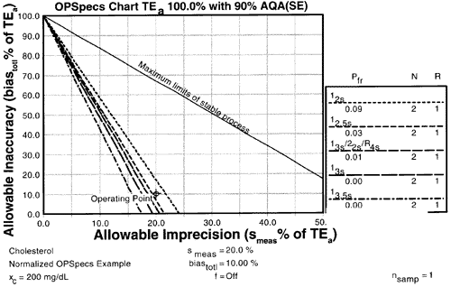
For cholesterol, given the normalized OPSpecs chart for N=2 above and the calculated operating point above (y=10%, x=20%), 90% AQA could be achieved with a 12s control rule and N=2, however, the expected 9% false rejection rate would generally make this choice too costly and therefore unacceptable.
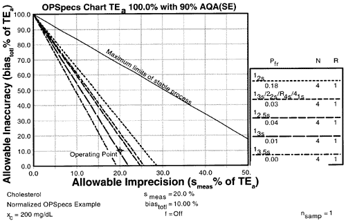
Using the normalized OPSpecs chart for N=4 shown here, the multirule procedure and the 12.5s rule will assure at least 90% detection of critical systematic errors and the 13s rule will provide very close to 90% detection.
Example glucose QC selection from normalized OPSpecs charts
Given an allowable total error of 6 mg/dL at a medical decision level of 50 mg/dL and an observed standard deviation of 1.2 mg/dl and an observed bias of 0.6 mg/dL, the operating point would have a y-coordinate of 10% [(0.6/6)100] and an x-coordinate of 20% [(1.2/6)100], which is the same normalized operating point as shown for the cholesterol method above. Thus, the same QC selections would be appropriate for this glucose method.
Note that the analytical quality requirement here is 12%, the observed imprecision is 2.4%, and the observed inaccuracy is 1.2%, which are all different values than observed for the cholesterol method. However, the operating points of the two methods are the same relative to the quality requirements of the two tests.
For your own applications
To try normalized OPSpecs charts for your own applications, print the directions and the charts (N=2 90%AQA, N=4 90%AQA, N=2 50%AQA, N=4 50%AQA) from this website, then use the normalized operating point calculator and manually plot that normalized operating point on the printed OPSpecs charts.
References
- Westgard JO. Charts of Operational Process Specifications (OPSpecs Charts) for assessing the precision, accuracy, and quality control needed to satisfy proficiency testing performance criteria. Clin Chem 1992;38:1226-1233.
- Westgard JO. Error budgets for quality management: practical tools for planning and assuring the analytical quality of laboratory testing processes. Clin Lab Manag Review 1996;10:377-403