Online Lessons
QC: The Levey-Jennings Control Chart
This lesson discusses one of the cornerstones of QC practice. We can no longer take for granted that everyone knows how to build a control chart, plot the control values, and interpret those results correctly. Patricia L. Barry, co-author of Cost-Effective Quality Control: Managing the Quality and Productivity of Analytical Processes, provides a primer on how to construct, use, and interpret the Levey-Jennings chart.
The Levey-Jennings Control Chart
- Example application
- QC procedure(s) to be implemented
- Calculation of control limits
- Preparation of control charts
- Use of control charts
- Answers for this exercise
- Interpretation of example test results
Please Note: This article is from the first edition. An updated version is now available in Basic QC Practices, 4th Edition
You can link here to an online calculator which will calculate control limits for you.
This exercise is intended to show, in step-wise fashion, how to construct a Levey-Jennings control chart, plot control values, and interpret those results. This assumes you already have (a) selected appropriate control materials, (b) analyzed those materials to characterize method performance by collecting a minimum of 20 measurements over at least 10 days, (c) calculated the mean and standard deviation of those data, and (d) selected the number of control measurements to be used per run and (e) selected the control rules to be applied.
See QC - The Materials for more information about selecting appropriate control materials. See QC - The Calculations for detailed information about calculating the mean and standard deviation. See QC - The Planning Process for a description of the approach, tools, and technology available to select QC procedures on the basis of the quality required for a test and the performance observed for a method.
Example application
For a cholesterol method, two different commercial control products have been selected that have concentrations near the important medical decision levels of 200 mg/dL and 240 mg/dL identified by the National Cholesterol Education Program (NCEP) guidelines for test interpretation. The materials were analyzed once per day for a period of twenty days. From these data, the means and standard deviations were calculated to be:
| Control 1 | Mean=200 | smeas= 4.0 mg/dL, or 2.0% CV |
| Control 2 | Mean=250 | smeas= 5.0 mg/dL, or 2.0% CV |
QC procedure(s) to be implemented
Each of the two control materials will be analyzed once per run, providing a total of two control measurements per run. Control status will be judged by either the 12s or 13s rule. These rules are defined as follows:
- 12s refers to the control rule that is commonly used with a Levey-Jennings chart when the control limits are set as the mean plus/minus 2s. In many laboratories, this rule is used to reject a run when a single control measurement exceeds a 2s control limit.
- 13s corresponds to a Levey-Jennings chart having control limits set as the mean plus/minus 3s. An analytical run is rejected when a single control measurement exceeds a 3s control limit.
The 12s rule is very commonly used today, and while it provides high error detection, the use of 2s control limits gives an expected high level of false rejections. The 13s rule provides an alternative QC procedure that has lower false rejections, but also lower error detection. In this exercise, you will see how to apply both QC procedures and also get a feel for the difference in their performance.
Calculation of control limits
Two sets of control limits will be needed to implement the rules described above. The first set uses 2s control limits (for implementation of the 12s rule) calculated as the mean plus or minus 2 times the standard deviation. The second set uses 3s control limits (for implementation of the 13s rule) calculated as the mean plus or minus 3 times the standard deviation.
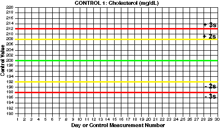
For this example, Control 1 has a mean of 200 and a standard deviation of 4 mg/dL.
The upper control limit would be:
200 + 2*4, which is 208 mg/dL.
The lower control limit would be:
200 - 2*4, or 192 mg/dL.
- What are the 3s control limits for Control 1?
- What are the 2s control limits for Control 2?
- What are the 3s control limits for Control 2?
Use the Javascript Control Limit Calculator to calculate these answers
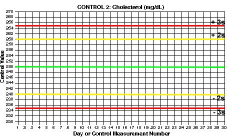
You should end up with 3s control limits of 188 and 212 for Control 1. For Control 2, you should have 2s control limits of 240 and 260 and 3s control limits of 235 and 265.
Preparation of control charts
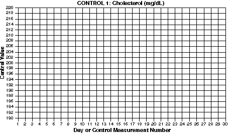
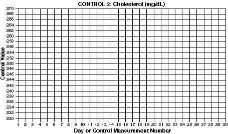
This exercise shows how to construct control charts manually using standard graph paper. For this exercise, graph paper having 10x10 or 20x20 lines per inch works well. You will need two sheets, one for each chart of the two control materials. While it is possible to prepare both charts on a single sheet, this may reduce the readability of the control charts. If you do not have graph paper available at this time, print out the lower resolution grids below.

Click here to get a larger chart you can print out separately.

Click here to get a larger chart you can print out separately.
- Label charts. Include the name of the test and the name of the control material in a prominent place so that this information is quickly and easily discerned when viewing the chart. The measurement unit, in this case mg/dL, can be included in the label or included in the label for the y-axis. Other information typically included on the chart are the name of the analytical system, the lot number of the control material, the current mean and standard deviation, and the time period covered by the chart.
- Scale and label x-axis. The horizontal or x-axis represents time and you will typically set the scale to accomodate 30 days per month or 30 runs per month. For this example, divide the x-axis into evenly sized increments and number them sequentially from 1 to 30. Label the x-axis "Day."
- Scale and label y-axis. The vertical or y-axis represents the observed control value and you need to set the scale to accomodate the lowest and highest results expected. A generally useful scale is to allow for a value as low as the mean - 4 standard deviations and a value as high as the mean + 4 standard deviations. For this example, the chart for Control 1 should be scaled to accomodate a range from 200 - 4*4, which is 184, to 200 + 4*4, which is 216. This can be rounded to 180 to 220 to fit the 10x10 or 20x20 grids of the graph paper. Mark off and identify appropriate concentrations on the y-axis. Label the y-axis "Control value." What is the range for scaling the chart for Control 2?
- Draw lines for mean and control limits. On the y-axis, locate the values that correspond to the mean and draw a green horizontal line (at 200 mg/dL for Control 1). Locate the values that correspond to the mean +2s and the mean -2s and draw yellow horizontal lines (at 192 and 208 for Control 1). Locate the values that correspond to the mean +3s and the mean -3s and draw red horizontal lines (at 188 and 212 for control 1). What are the mean and control limit lines for Control 2?

Click here if you want to print a larger version of this chart separately.

Click here if you want to print a larger version of this chart separately.
Use of Control Charts
Once the control charts have been set up, you start plotting the new control values that are being collected as part of your routine work. The idea is that, for a stable testing process, the new control measurements should show the same distribution as the past control measurements. That means it will be somewhat unusual to see a control value that exceeds a 2s control limit and very rare to see a control value that exceeds a 3s control limit. If the method is unstable and has some kind of problem, then there should be a higher chance of seeing control values that exceed the control limits. Therefore, when the control values fall within the expected distribution, you classify the run to be "in-control," accept the results, and report patient test results. When the control values fall outside the expected distribution, you classify the run as "out-of-control," reject the test values, and do not report patient test results.
- Plot control results. For practice, the accompanying table provides some control results for our example cholesterol method. Plot these results, one from Control 1 and one from Control 2, for each day. You can print the Levey-Jennings QC Practice Exercise (below) to obtain a worksheet that shows all these control results. For day 1, the value for Control 1 is 200 and Control 2 is 247. On the chart for Control 1, find the value of 1 on the x-axis and the value of 200 on the y-axis, follow the gridlines to where they intersect, and place a mark; it should fall on the mean line. On the chart for Control 2, find the value of 1 on the x-axis and the value of 247 on the y-axis, then mark that point; it should fall a little below the mean line. In plotting control values, it is common practice to draw lines connecting the data points on the control chart to provide a stronger visual impression and make it easier to see patterns and shifts.
Cholesterol example where: |
||||||
| Day | Control 1 Value |
Control 2 Value |
12s Rule Violation |
13s Rule Violation |
Accept(A), Warning (W), or Reject(R)? |
Comments |
| 1 | 200 | 247 | ||||
| 2 | 205 | 250 | ||||
| 3 | 195 | 255 | ||||
| 4 | 202 | 243 | ||||
| 5 | 186 | 254 | ||||
| 6 | 207 | 263 | ||||
| 7 | 194 | 251 | ||||
| 8 | 209 | 264 | ||||
| 9 | 200 | 253 | ||||
| 10 | 196 | 244 | ||||
| 11 | 190 | 261 | ||||
| 12 | 204 | 254 | ||||
| 13 | 196 | 239 | ||||
| 14 | 207 | 236 | ||||
| 15 | 200 | 250 | ||||
| 16 | 205 | 259 | ||||
| 17 | 209 | 257 | ||||
| 18 | 197 | 256 | ||||
| 19 | 196 | 249 | ||||
| 20 | 198 | 257 | ||||
| 21 | 197 | 241 | ||||
| 22 | 195 | 255 | ||||
| 23 | 198 | 250 | ||||
| 24 | 199 | 259 | ||||
| 25 | 191 | 247 | ||||
| 26 | 197 | 242 | ||||
| 27 | 190 | 256 | ||||
| 28 | 202 | 246 | ||||
- Interpret control results. Apply the 12s and 13s control rules and make a decision whether you should accept or reject the run for each day. The control values for the first day are in-control and the patient results can be reported. Continue plotting the 2 control values per day and interpreting those results. Circle those points that correspond to runs that should be rejected. Keep track of the control rules that are violated on the worksheet for the Levey-Jennings QC Practice Exercise. Patient results obtained in runs where the 13s rule is violated are most likely incorrect. Results obtained in runs where the 12s rule is violated may or may not be incorrect because there is about a 10% chance of this occurring even when the method is working perfectly. This is a "false alarm" problem that is inherent with the use of 2s control limits with an N of 2. In spite of this serious limitation, many laboratories continue to use 2s control limits an just routinely repeat the run and the controls, or sometimes repeat only the controls by themselves. Note that if a control is out a second time, the actual control rule that is being used to reject a run is a 22s rule rather than the stated 12s rule. Unfortunately, the 22s rule by itself is not very sensitive, therefore, it is better to use the 13s and 22s rules together in a multirule procedure to improve error detection while, at the same time, maintaining a low false rejection rate. We'll provide more discussion of multirule QC procedures in a later lesson.
